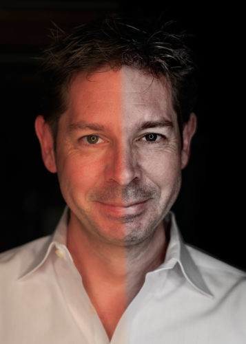
 I needed a new photo for my LinkedIn profile and wanted something that shows maturity but not age. Here’s how I added the grime to a standard photo to get the desired results.
You’ll recall that a while back I built a continuous light ring for my Pretty Ugly People study: I used that on myself and produced this very red (damn you auto white-balance!) picture.
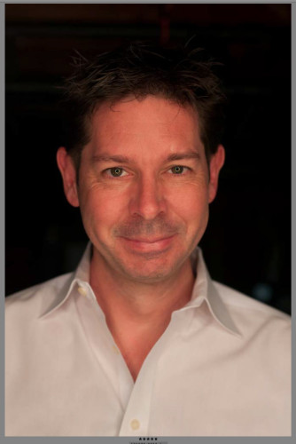 This tutorial will show the simple steps I took to turn the above (camera raw, unprocessed) image in to the old man below.
In order to achieve this effect we’re going to process the same raw file twice. The first time we’ll get the image’s color balance right, the second time we’ll go for contrast and lines.
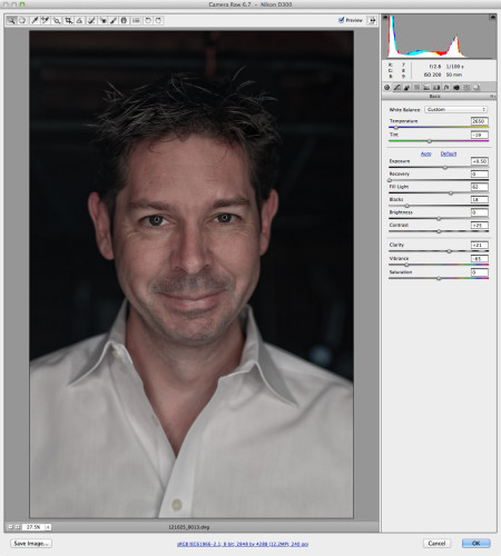 Open your file in camera raw, and process in to a pleasing if not perfect image. Correct the color cast, lower the vibrance, increase the clarity, and set the exposure just so. Here’s the first trick. Don’t press “done”. Don’t press “open”. Hold down the shift key and you’ll notice that the “open” button changes to “open as object”. Press it.
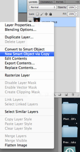
Now you’re in Photoshop and the first layer is an object. This means you can double click the icon and go back to camera raw. How cool is that! We’re going to right click the object in the layers pallet and bring up the menu. Select “new smart object via copy”.
You now have two layers. Both the same. And both linked to separate, different copies of the same raw file. Double click the new icon and open camera raw again.
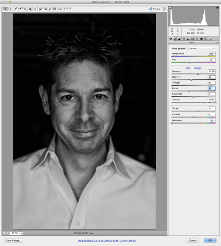 This time round, we’re going to make the image as high-contrast as we can. Additionally, we’re going to remove all the color. So Saturation at zero, contrast at the max, fill light as high as you can take it, blacks high, recovery high, and exposure low. Hit ok and you’re back in Photoshop.
We now need to blend these two images in to a single superb shot. We’re going to take the contrast from the top layer and apply it to the color from the bottom layer. Change the layer blend mode (using the drop down at the top of the layers pallet) to “luminosity”.
Pretty cool I think you’ll agree. If you don’t like the effect, you can always double click those thumbnails again, and go back to the the raw and try some different settings.
 The image I ended up with was just a little dark, so I next added a curve layer, and using the drop down selected “lighter”. This made the image just a bit too bright, so I manually pulled the curve into the shape you see above.
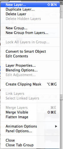
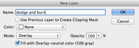
The background of my image was not as clean as I wanted, and my hair was too dark. So the next thing to do was to create a Dodge and Burn layer. You do this by pressing the little down arrow on the top right of the layers pallet and bringing up the menu. Select “new layer” and you get a dialog box allowing you to define the layer. You want an overlay layer set to 50% gray.
Using the dodge and burn tools paint on this layer where you want areas to be darker (burn) and lighter (dodge). The beauty of doing all this on a separate layer, is that if you go wrong, you can simply throw it away and start again.
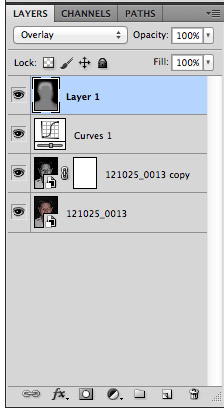 Here you can see how I’ve painted the layer darker where the background is, and lighter where my hair is.
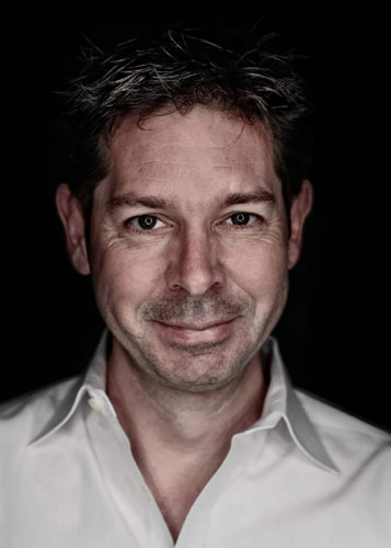
And you’re done.
Grime added to a picture.

Come on, talk to us!